|
Additional Info
|
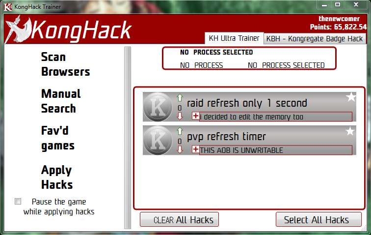
So since "Select all hacks" is around, maybe "clear selection" would be good as well, I've ran in to several situations where it would have been very useful. |
|
Additional Info
|
+1 |
|
Additional Info
|
Cybafish20 Posted on: 04/10/2015 4:37am So since "Select all hacks" is around, maybe "clear selection" would be good as well, I've ran in to several situations where it would have been very useful. Yes! that would be awesome :D Also...the ability to favorite a hack would be nice too, so you don't have to scroll around
|
|
Additional Info
|
mock it up in paint or something and i'll add it in I use this AoB tool to make all the AoBs I post. Try the online version if you dont feel like downloading it. |
|
Additional Info
|
|
|
Additional Info
|
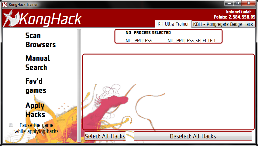
why is clear on the left? i'm not sure I like that. I use this AoB tool to make all the AoBs I post. Try the online version if you dont feel like downloading it. |
|
Additional Info
|
kolonelkadat Posted on: 04/11/2015 6:46pm why is clear on the left? i'm not sure I like that.
|
|
Additional Info
|
thenewcomer Posted on: 04/11/2015 10:31pm kolonelkadat Posted on: 04/11/2015 6:46pm why is clear on the left? i'm not sure I like that.
That is quite convincing actually :D
|
|
Additional Info
|
thenewcomer Posted on: 04/11/2015 10:31pm kolonelkadat Posted on: 04/11/2015 6:46pm why is clear on the left? i'm not sure I like that.
I use this AoB tool to make all the AoBs I post. Try the online version if you dont feel like downloading it. |
|
Additional Info
|
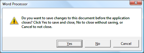
In installations Yes\Forward\Ok\whatever is mostly on the right and No\Back\Cancel\yaddayadda to the left but in programs is more likely the reverse like shown on Kolonel picture. |
|
Additional Info
|
Nuriell Posted on: 04/12/2015 4:11am have Select All Hacks to the left look better but two buttons with equal dimensions also look better. I use this AoB tool to make all the AoBs I post. Try the online version if you dont feel like downloading it. |
|
Additional Info
|
kolonelkadat Posted on: 04/12/2015 7:09pm Nuriell Posted on: 04/12/2015 4:11am have Select All Hacks to the left look better but two buttons with equal dimensions also look better.
Can you also add the option of favoriting hacks and "select fav hacks" button? It would help seperate the working hacks and the non-working hacks :D
|
|
Additional Info
|
Yeah I like how you did it, it feels better to have Deselect on the right |
|
Additional Info
|
styruslolz Posted on: 04/12/2015 8:02pm kolonelkadat Posted on: 04/12/2015 7:09pm Nuriell Posted on: 04/12/2015 4:11am have Select All Hacks to the left look better but two buttons with equal dimensions also look better.
Can you also add the option of favoriting hacks and "select fav hacks" button? It would help seperate the working hacks and the non-working hacks :D start a new topic. get some drawings going. get some discussion going. Cybafish20 Posted on: 04/12/2015 11:10pm This was integrated rather quickly :P I use this AoB tool to make all the AoBs I post. Try the online version if you dont feel like downloading it. |
|
Additional Info
|
Well my picture DID have a star icon for favoriting a hack. |


