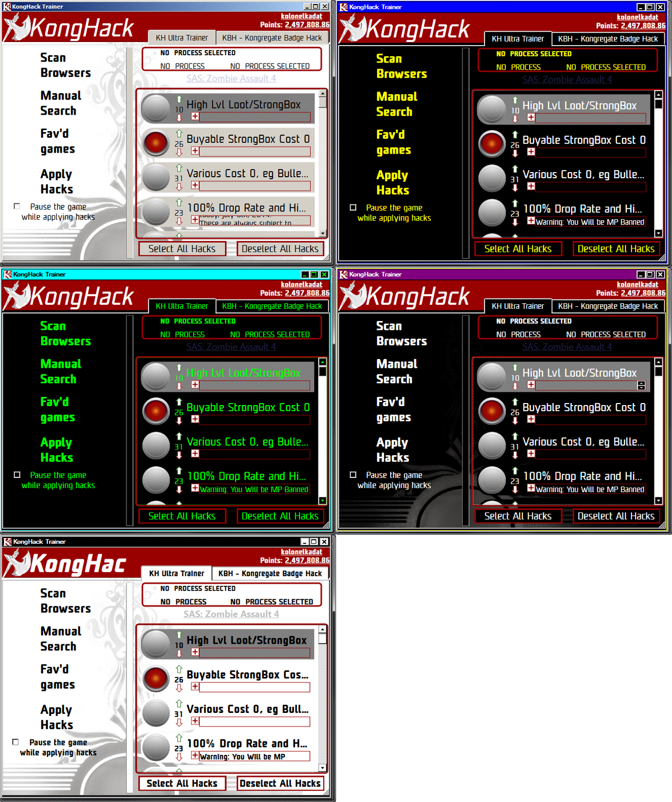
KHUT UI Update Suggestions
RE: KHUT UI Update Suggestions Posted on: 06/05/2016 3:25am
Quote Post
Never let a computer tell me shit.

anyone have any suggestions about what to do about this situation?


one complaint I know is that nobody seems to realize that the red + expands the description box


I use this AoB tool to make all the AoBs I post. Try the online version if you dont feel like downloading it.
"Obviously, windows are central to Windows. They are so important that they named the operating system after them. But what is a window?"

RE: KHUT UI Update Suggestions Posted on: 06/05/2016 6:42am
Quote Post
kolonelkadat Posted on: 06/04/2016 11:25pm

anyone have any suggestions about what to do about this situation?


one complaint I know is that nobody seems to realize that the red + expands the description box


Someone asked a similar question and got some seemingly satisfactory answers: http://ux.stackexchange.com/questions/37686/how-should-you-show-that-an-accordion-is-expanded
 

RE: KHUT UI Update Suggestions Posted on: 06/05/2016 8:35am
Quote Post
Ubi Maior Minor Cessat

it's not a panacea but expanding the hack description when the hack is selected/clicked on sounds like a good idea overall. Encasulating it in a toggable setting is also probably a good idea

RE: KHUT UI Update Suggestions Posted on: 06/06/2016 2:47am
Quote Post
Never let a computer tell me shit.

kongregatehack i read your link and the most annoying thing it said was that "+" and '-' were the most obvious annunciators for users lol.

i think one of the main things i want to do now is ditch the old color scheme and make something that will be more compliant across windows themes.


I use this AoB tool to make all the AoBs I post. Try the online version if you dont feel like downloading it.
"Obviously, windows are central to Windows. They are so important that they named the operating system after them. But what is a window?"

RE: KHUT UI Update Suggestions Posted on: 06/06/2016 4:37am
Quote Post
Oh, hey...

The one with black and purple looks really badass. Try that; unless you have more color schemes for it.

RE: KHUT UI Update Suggestions Posted on: 06/09/2016 2:26am
Quote Post
Never let a computer tell me shit.
alfred Brennan Posted on: 06/02/2016 11:25pm

Is it possible to put an open cheat engine button on there and put down the none AOB guide for games that don't currently have an AOB hack.


the none aob guide already exists, but due to a slight error in logic, may or may not be displayed. This has been fixed in the next release.


I use this AoB tool to make all the AoBs I post. Try the online version if you dont feel like downloading it.
"Obviously, windows are central to Windows. They are so important that they named the operating system after them. But what is a window?"