[Suggestion] Service Icons on Trainer and Improved Auto-Voting
Dark Lord

Trainer Version: Any
Operating System: Windows 7 x64

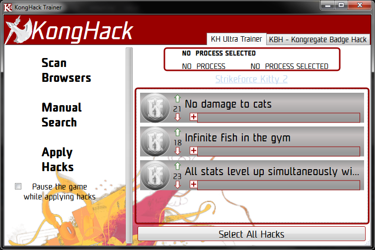
Suggestion: I don't know if this is already suggested but i think that putting the Service Icons (Kongregate, Newsground, etc,) near the hack in the trainer will greatly help selecting the usable codes of a game on a specific service, expecially if the game have a lot of hacks and in the same time this will greatly help preventing false votes.

With this implement the auto-vote system can also be tweaked to upvote or downvote an hack only on the right Service, so if an hack is for a game on Kongregate and a player try it on Newsground there will be no vote.

An extra can be that if an hack is used on a different Service and it work the Symbol is automaticcally added to the game so the hack can be voted even in this added Service.

I also think that using a different colors for unwraitable hacks will also hlep in not making mistakes (i was unaware of unwriteable hacks and made a lot of mistakes until an user of this site explained them to me).

I don't know how much work will be that but reading around i think that those things can greatly improve the hacking experience and in the same time reduce problems for the site.

Thanks for reading and i'm sorry if my english is not so good.

Never let a computer tell me shit.

GUI improvements are easy to implement, but the design is hard. I have no idea where I would put the service annunciator. 

Draw it, and I'll do it.


I use this AoB tool to make all the AoBs I post. Try the online version if you dont feel like downloading it.
"Obviously, windows are central to Windows. They are so important that they named the operating system after them. But what is a window?"

Dark Lord

I'm not good at all at drawing but i can hint where to put them, the best way is to put the icons inside the buttons that toggle the hacks on and off, the first used in the hack as main and the others on mouseover if possible.

If mouseover is a no-no they can show the icon only on hacks that have the icon of the Service you are on (easy done by catching the url for where you are lounching the trainer).

Another alternative is to increase a bit the main windows size and add all the icons for an hack on the right or on the left of the selectable codes space.

Never let a computer tell me shit.

like this?
does it need more?


I use this AoB tool to make all the AoBs I post. Try the online version if you dont feel like downloading it.
"Obviously, windows are central to Windows. They are so important that they named the operating system after them. But what is a window?"

To be honest, I love the layout you have right now. Without doing much reading at all, I managed to navigate through the process quickly and painlessly; It's really intuitive, in my eyes.

TIM the Enchanter
Level: 1
ADR Info

Kolonel,

Hacks can have more than one service associated with them.  How would you handle that?

~TiM


Everything's coming up KongHack!

"When you know nothing matters, the universe is yours" ~Rick Sanchez

Never let a computer tell me shit.

i reckon id just layer em up.


looks pretty good to my eyes


I use this AoB tool to make all the AoBs I post. Try the online version if you dont feel like downloading it.
"Obviously, windows are central to Windows. They are so important that they named the operating system after them. But what is a window?"

Dark Lord

This will be perfct in my opinion, even if the multy-layer can be a bit chaotic but i don't see many game having 2 or more icons.

TIM the Enchanter
Level: 1
ADR Info

Kong, NG, and Armor all at once is the most I can think of off hand.


Everything's coming up KongHack!

"When you know nothing matters, the universe is yours" ~Rick Sanchez

Never let a computer tell me shit.

i was like super duper kidding about just stacking them up like that. Im not doing that.


I use this AoB tool to make all the AoBs I post. Try the online version if you dont feel like downloading it.
"Obviously, windows are central to Windows. They are so important that they named the operating system after them. But what is a window?"

The Laziest Man on KongHack
kolonelkadat Posted on: 01/05/2015 9:29pm

i was like super duper kidding about just stacking them up like that. Im not doing that.


thank god. can you imagine what it would look like for hacks that work on all platforms 0.o

anyways, perhaps you could drop the hack name down a little bit, lower the font size by 1 or 2, and put the icons above it, so itd be 3 lines instead of 2.


The Mentally Challenged

Just a suggestion for noobs like me: Something that tells WHEN to apply the hack. I know someone writes it, but a checkbox or dropdown with "after load" "before load" or something third but common when submitting the hack. I've had a hack downvoted because I may have used it at a wrong time. I believe I corrected the error, but in order to prevent that from happening. 


Don't waste too much time reading this.

I tend to agree with LeUsername; Some of us are pretty derp, and this program is all about making it user-friendly. 

Side note, for the multiple services; I don't know how hard it is to implement, but something that detects which service a given hack applies for, and then doing something simple like shrinking down the icons, such that it'd be the kong K, or a smaller K and the armor games tower, etc; As long as the color schemes are pretty separate (which, afaik they are), it'd still be easy to tell which ones a given hack applies to, even if they get really small.

Nuriell has a good idea. Might try to render a picture using Kolonel's as a base. Extended cheat area with 3 icons next to the buttons. possibly have which service(s) the hacks can be used on. Ill post it later. (Busy repairing a computer for 0 cash ~.~)